
Product Designer for Shopping Platform
Shopping Platform — Hackathon #WirVsVirus
Mar. 2019 – Aug. 2019
Product Designer
www.smallbusinesshero.de
SmallBusinessHero was born during the Hackathon #WirVSVirus organized by the German government on 20-22 of March 2020. It sought to promote digital solutions to help people fight many of the issues the pandemic brought. SBH’s goal is for our neighbourhoods to stay as vibrant as they were before the virus.
Tasks
Research and concepts
Prototyping
Building the design system
User Testing
A/B Testing
Documentation
Onboarding
Tools
Sketch
Photoshop
Illustrator
Github
Invision / DSM
Sticky Notes
Pen and Paper

Goal
SBH's goal is to help small businesses keep afloat during the time of Corona. By giving small shops a place online, business owners can show their products and promote their shop. It aims to bring shops a step closer to you. You, the shopper, become the small business hero for buying from them.
Set-Up
SBH is a non-profit, open-source, agile team using Github and Slack. We are a team that fluctuates in size - between 10 and 20 people working on the project. Since the kickoff of the idea has been growing and evolving iterations.
Methods
Atomic Design
Agile Methodology
Iterative
Open Source

The Role
I joined the team to support the design. Over the course of the project, I contributed by shaping the image of the product. I created a UI-Library, took care of the Art Direction, and evolved the visual/emotional concept. I started the initial UX concept for the MVP, which iterated as the project evolved.
The Approach
I was presented with information from those who played the project owner role. After understanding the goals and targets, I started by creating a user journey. Then created a userflow of what we wanted to achieve. Thumbnails at a page level were used to illustrate the flow to the team. I then did blockframing as I went more in-depth after receiving requirements from the team. I moved onto wireframes once the concept made sense to those involved. Once the team was happy with the results, I did the interface and a quick prototype (which can be seen in the video).
Design Process
I’ve used the following steps as part of the process for this project.

Information architecture
Each part of the team had different requirements that needed to be present in order to build the two main functions: get owners to sign up, and get people to shop. We had to divide these 2 routes to make a clear path for these journey.
Sketches and idea validation
I sought feedback by sharing sketches, wireframes, and ran quick usability tests with my colleagues and random users. From these sessions, the users drove my design to a very clean layout.
Solution
The website splits into this 2 journeys for now, to either get the user to shop or to sign up to display their store. The one shopping is encouraged to search for stores in their neighbourhood, that way they become a small business hero.


Blockframing, MVP, and first iteration
Art Direction
The design was chosen after various preference tests. The art direction of the website aims to showcase content first, as well as the typography. These should be prominent as they tell the story of those whom we wish to put a spotlight on.

Typography
Merriweather is a medium-contrast semi condensed typeface. It is designed to be readable at very small sizes. Merriweather is traditional in feel despite the modern shapes it has adopted for screens.
Montserrat; The old posters and signs in the traditional Montserrat neighborhood of Buenos Aires inspired Julieta Ulanovsky to design this typeface and rescue the beauty of urban typography that emerged in the first half of the twentieth century. […]
The Montserrat Project began with the idea to rescue what is in Montserrat and set it free under a libre license, the SIL Open Font License.


Colours
The colours chosen for the website came from a preferred Art Direction for the project. Subtle colours are used to make sure both content and typography stand out.

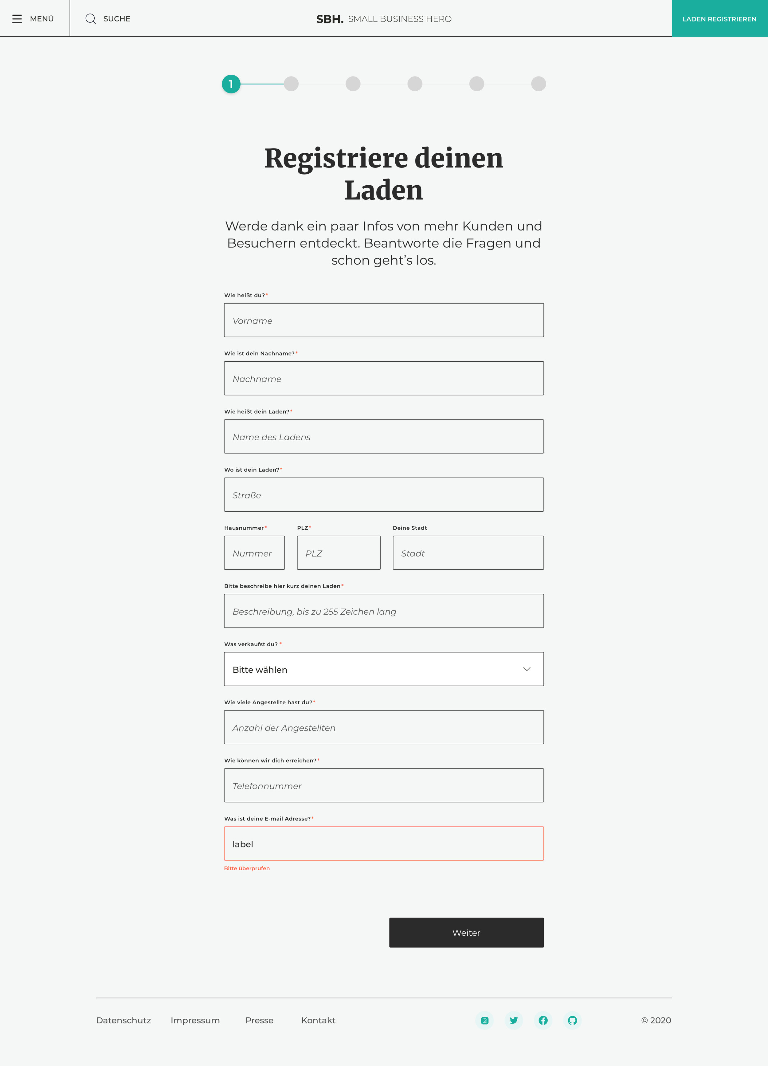
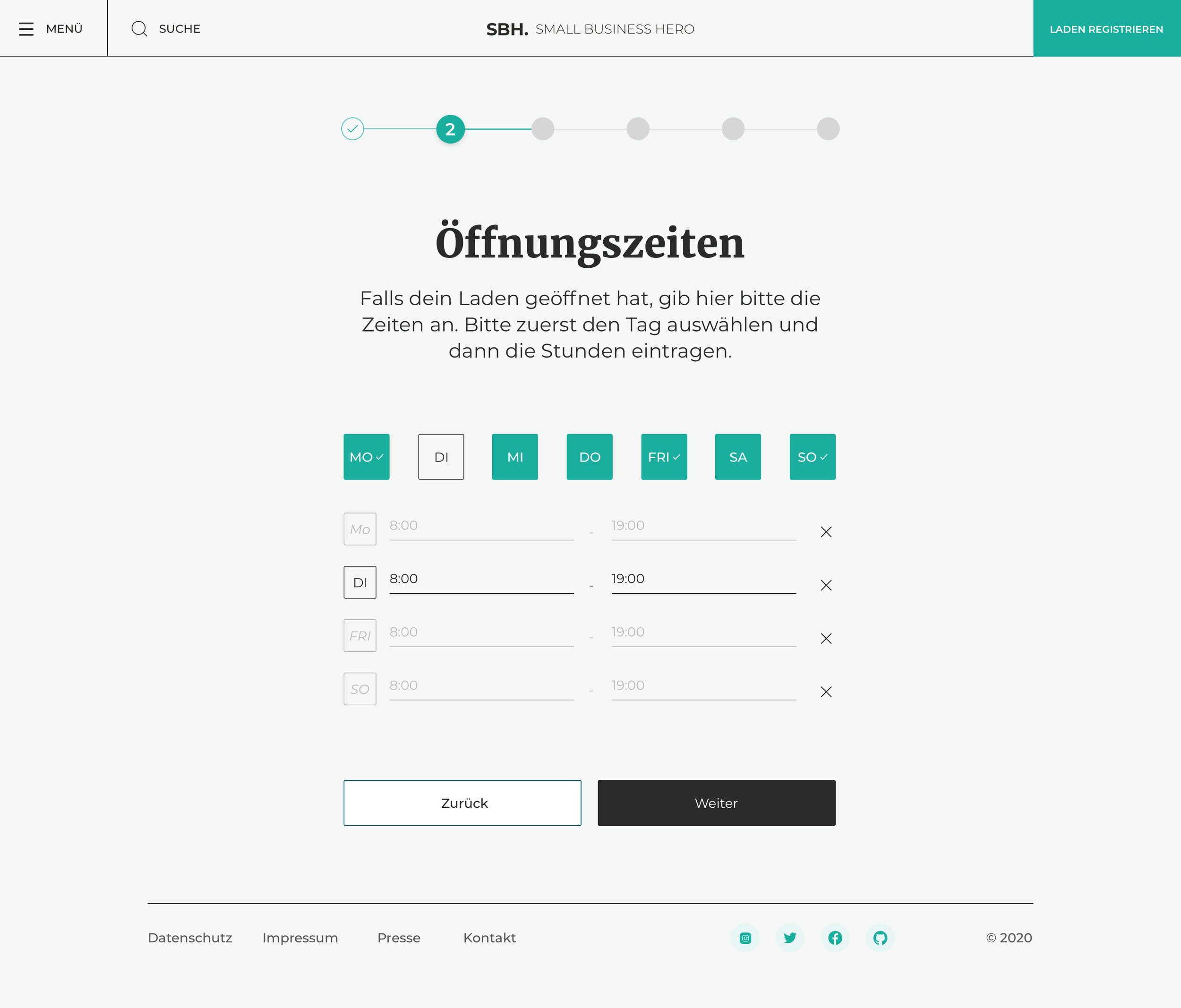
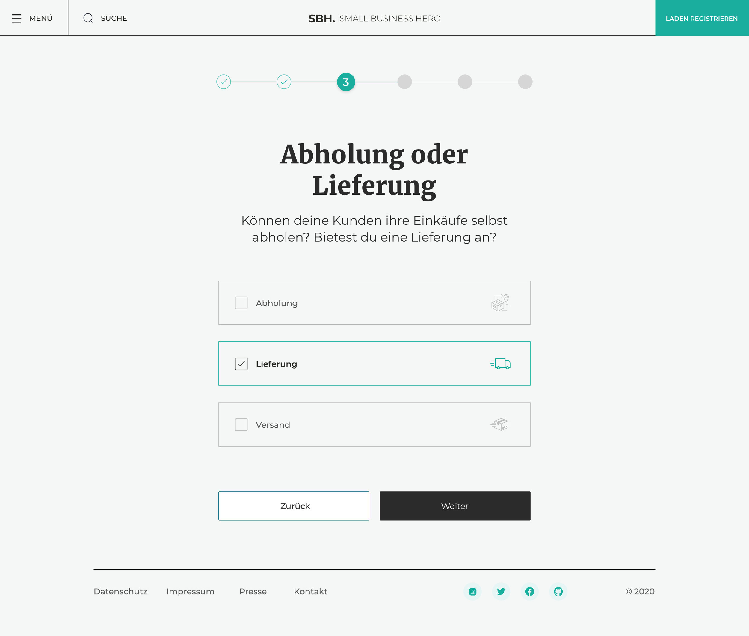
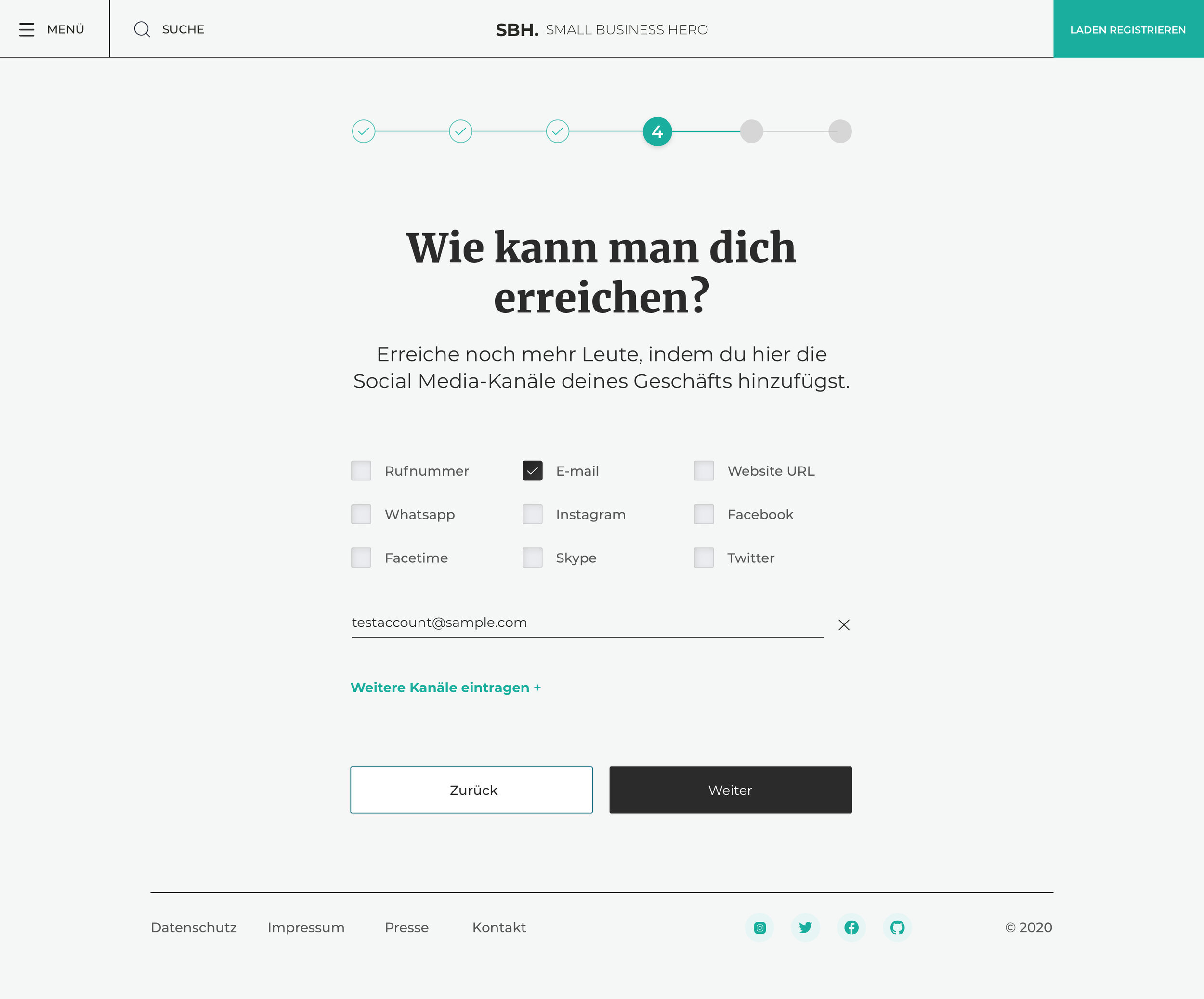
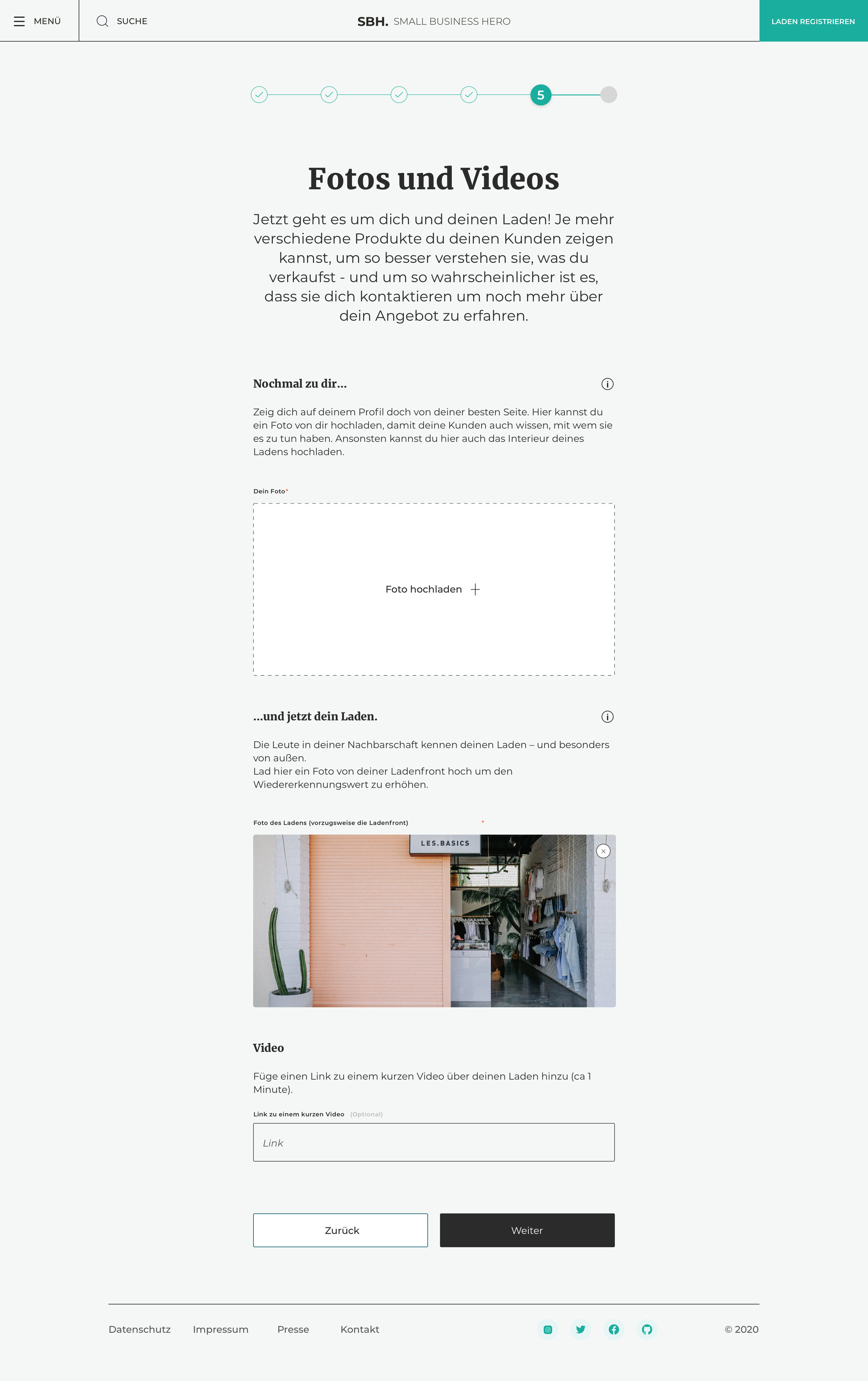
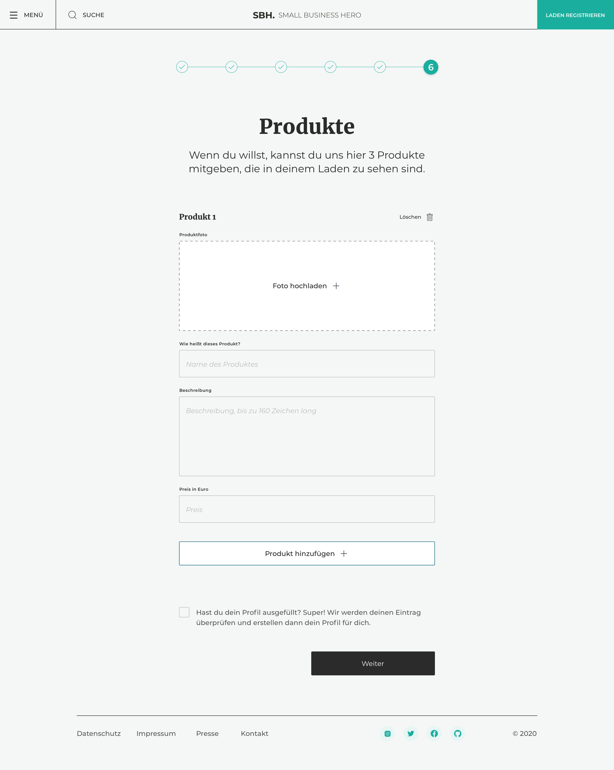
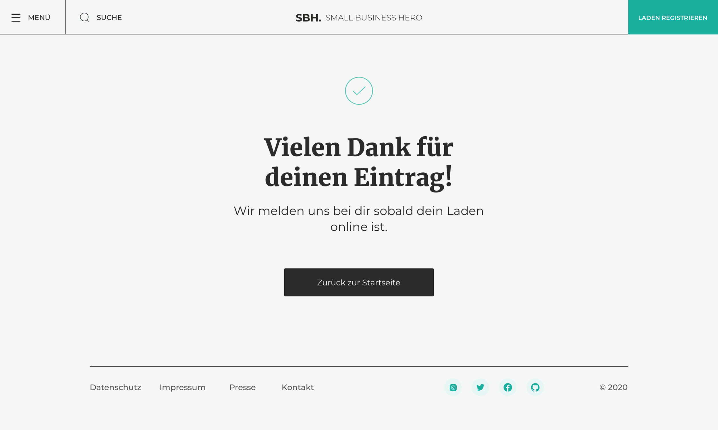
The Store Owner’s Journey
The sign-up form is our initial entry point to all the requirements. It allows the shop owners to provide an overview and detailed information about their businesses.
Takeaway
This experience has been very enriching and very rewarding. It is a good cause; the idea of helping our neighbours, friends, and families to keep their businesses stay afloat. Creatively, it has been extremely open and very fast-paced. It truly placed the user’s requirements and needs first. It was a unique experience since the project is volunteers, to those who need help. We had no one to answer to, but the small businesses' needs.