
A mini case study
Colours for Accessibility
Diconium’s website is not meeting all the accessibility requirements at the moment. This mini case study focuses on the primary colours of Diconium’s branding and explores the best solution for their digital presence.
Role
UI/UX Design
Client
Diconium
Date
Dec. 2021 – Feb. 2022
Tasks
Research &
Knowledge sharing
Tools
Sketch
Invision Studio
Accessibility by 2025.
Starting 2022, accessibility within Europe will be prominent within the digital industry. The national laws developed by the Member States that comply with the European Accessibility Act (EAA) will be published by June 28, 2022. There are services and products where requirements must be implemented.
This short case study focuses on the primary colours of Diconium and explores how these colours are perceived when there are visual issues present. The links next to this introduction are about the topic of accessibility and the full thinking process of this deep dive.
Web Accessibility in a nutshell.
Within the EU, Web accessibility has a lot more importance this year. Products and services must be accessible before 28 June 2025.
Jan 18 · 7 min read
Colours for Accessibility: A mini Case Study
In 2020, 49 percent of German companies with 20 or more employees were taking certain products or services off the market as a result of
Feb 16 · 10 min read
Colours for Accessibility: A mini Case Study (part II)
Following my last post, what about sustainability? Reducing inequality on the web is one of the aspects. We can achieve it by empowering…
Feb 16 · 10 min read
The initial colour palette.
I have taken the colours of Diconium to do a deep dive. They are working with a linea by hue colour palette. I took the orange and purple to be tested and expanded into a colour system.
Primary
For this case study, I am testing the colours orange and purple. These 2 are labelled as their primary colours. The general branding of Diconium sets four different colours as primary. I would like to see which colour would work best for accessibility.
Neutral
These colours are used for text, shapes, borders, and system icons. The colours black and white fall under neutral colours.
Secondary or Accent
Depending on how you choose to set up your colour system, an accent colour could also be within the family of your primary colour. A secondary colour will remain separate from the primary. Diconium has 4 different secondary colours in their branding. For the web colour guide, I decided to not go further in this direction and focus on the primary colours.
Semantic
Semantic colours provide meaning as per their function. This is done based on the usage pattern of such said colour. These colours are used occasionally to set an intention. Warning, success, error, and information are patterns in semantic colours. These don’t exist yet within Diconium’s guidelines.
Data
These colours will help you visualize data, usually, sets of 10–20 colours will help with the task. These don’t exist yet within Diconium’s guidelines.

Sequential Palette
After deciding on the primary colours, purple and orange, I expanded them into a sequential scale from the base colour. Colours should match in hue, lightness, and saturation. Sequential scales expand from darkest to lightest, having the base colour somewhere in the middle.
Semantic colours
These colours should also be tested for accessibility to meet level AA at least. Semantic colours should be harmonious with your primary colour. They need to match the initial palette as well. One can achieve this by playing with the hues.

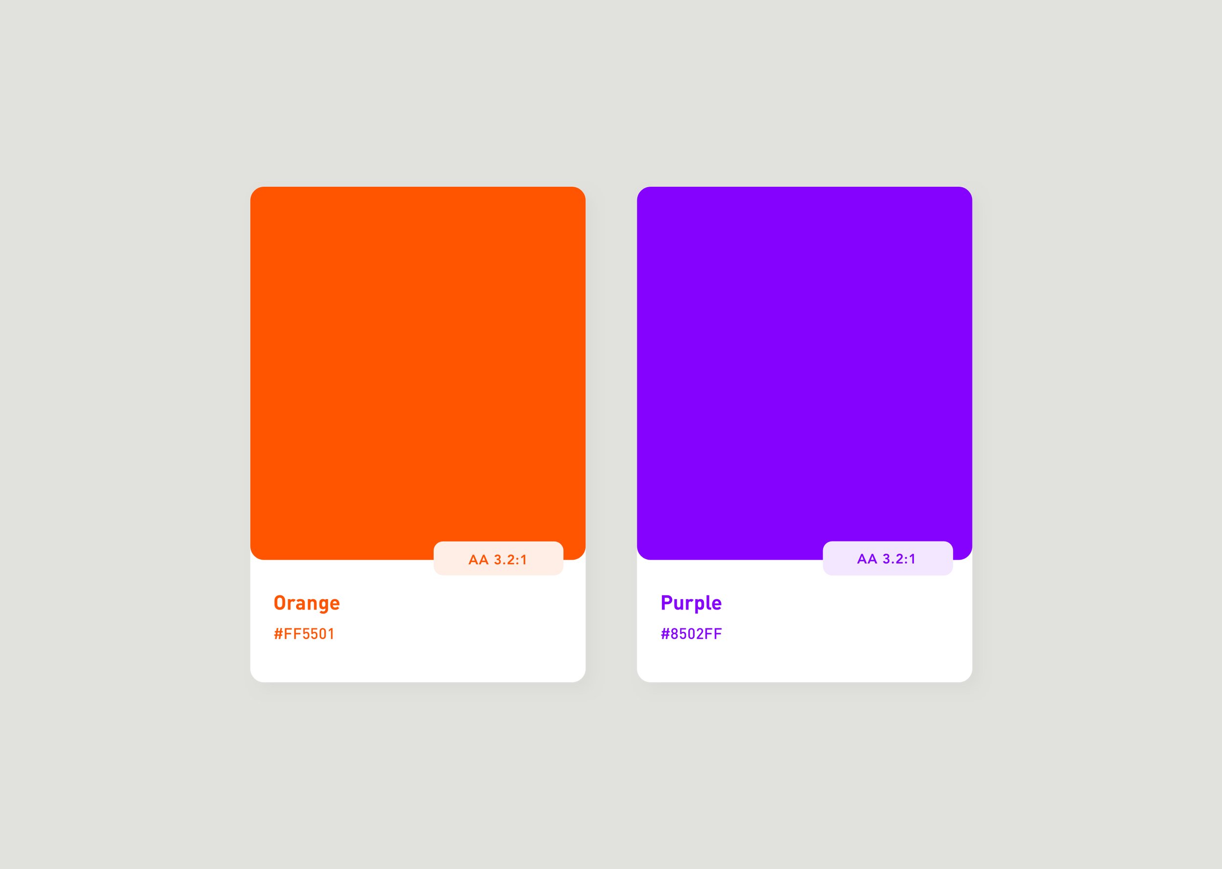
Accessibility Check
As my sequential palettes have been set, I have run an accessibility test. This is the combination of the different chromatic colours against the neutrals. To achieve accessibility, there are two standards you will have to achieve. Level AA (recommended) and Level AAA (depends on the target).

Orange
It needs a contrast ratio of 3:1 for large text (18pts). Or 4.5:1 for the smallest text size of 16pts (an exemption is a logo, for instance). White text on orange doesn’t pass Level AA. It passes a no-text contrast ratio. Black text on orange passes Level AA but doesn’t meet Level AAA.
Purple
It requires a higher level of contrast 4.5:1 for large text and 7:1 for 16pts text. White text on purple passes Level AA. However, it doesn’t pass Level AAA. Black text on purple doesn’t pass Level AA. It passes a no-text contrast ratio.


The accessibility of the colour orange
Some colours, such as certain shades of blue and orange, work better combined with a colour that doesn’t achieve the level of compliance. This is because of the high luminance contrast, in this case, of white text. White is pure luminance, which makes it the strongest form of contrast.
Colour Simulation
The most common types of colour blindness are those in the red-green category. In the colorblind population, deuteranomalous (or green-weak) vision is by far the most prevalent. The official breakdown is as follows: Protanopes 12.5%, Protanomalous 12.5%, Deuteranopes 12.5% and Deuteranomalous 62.5%.

Original colours (orange and purple).

Pranopia and Deutaronopia visual simulation (Red-Green colour blindess).

Tritanopia visual simulation (Blue-Green colour blindness).
Colour System
Each tone will have specific values for communication purposes within the colour system. These colours show a certain action or behaviour as they serve as visual cues to the user which become patterns used across any interactive elements you will create. These visual cues can be states within your elements.
Sequential palette
The base colour will expand in various shades either in lightness or darkness. The base colour starts at 500. From there, you have steps going up or down. Depending on how you choose to set up, you will end up with 10–12 steps. *Base-Colour* will increase and decrease with a respective ratio to achieve its lightest and darkest form. These steps are then labelled from 100 until reaching 900 in 100 increments. These numbers are the relative to the shades of the colour. One can have extra lighter shades if needed, then the lower number can go to -75 & -50. The percentage of lightness within the light colours will have to be greater. This will allow contrast between the lighter forms.
Dark Mode
Why are desaturated colours necessary? This is because desaturated colours will allow more contrast. They are more luminous against the dark backgrounds. Saturated colours fail WCAG’s accessibility standards of at least 4.5:1 for body text against dark surfaces.
Issues and Benefits
Issues -People suffering from astigmatism or myopia will encounter problems with this mode as dark backgrounds can cause a “halation effect” for users with astigmatism.
Navigating with a keyboard might also be difficult with this mode. The visual cues for the focus state might not be strong or distinguishable enough.
Benefits - Dark mode reduces blue light exposure and cuts glare.

States


Focus
Focus states draw attention to a certain element. Those using navigation aid profit from this state. While browsers come with a default focus state, one can override it. Hence why this state needs to be checked for a good contrast to ensure accessibility. Focus states need to have at least a 3:1 contrast ratio against the background colour. They can be a border, background, or within a button.
Active
With an active state one is able to see that the element is currently active. They were successful in using the element. This state should be noticeable and more subtle than the hover state.
Hover
Hover states make the user aware that the element is interactive. Since the user is more than likely aware of where they are, the colour change can be more subtle than the focus state.
Shapes and Patterns
Applying a colour-blind approach to your designs will help colorblind individuals. Colour-blind individuals will be able to distinguish between colours when applying texture or patterns. They won't fear colour influencing their perception. Communication shouldn’t rely on colour only. When using semantic colours use other visual cues for enhancing the communication patterns.


Takeaway
To find semantic colours, one has to adjust them to match the hues of the main / default colour. Yet, to have an aesthetically pleasing and accessible colour palette, these colours need to be adjusted in saturation/light to match both the palette and accessibility levels. There is no 1 to 1 dark-mode palette. If we start designing on the light mode, then the dark mode colours could need adjustments. Only then they will have a different lightness degree and enough contrast. Colours in light themes need more saturation and colours in dark themes less saturation to have higher contrast and reach AA levels. Choose a colour system, not a colour palette. This will be beneficial for the UI as it is part of the foundation. Start your design (products or services included) with a clear understanding and intention. Don’t add accessibility towards the end of the process to simply protect the business. For this type of thinking, you have already failed.